
Hot Days and Nights Deserve Haute Nails
This post may contain affiliate links, which means I may receive a small commission, at no cost to you, if you make a purchase.
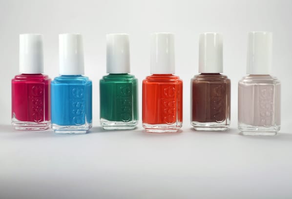
Essie Haute in the Heat – Swatches and Review
Though I look forward to it every year, most of my summer is spent looking at pictures of white sand beaches while I sit in my overly air-conditioned office and try to convince myself that having a California Club for lunch counts as “enjoying the summer.” No fear, fellow cubicle dwellers. Essie has our back with its second summer collection
Introducing Essie Haute in the Heat; a mini collection of six shades that are just as appropriate for the beach as they are for the boardroom. (As long as your boardroom doesn’t frown on green nail polish.)
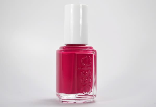
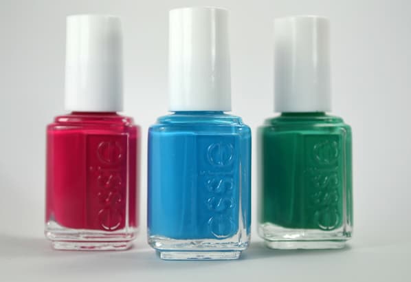
Haute in the Heat – hot guava
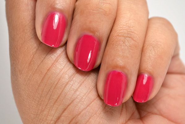
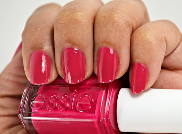
First up is Haute in the Heat’s eponymous hot pink creme. While gorgeous enough to lend its name to the collection, it’s very close to other deep, raspberry polishes, especially Essie’s own Watermelon. This was the only color in the collection that I didn’t have to apply more thickly; Haute in the Heat was nearly opaque in one coat, but all the others needed two coats to hide bald spots from a sheer but fast drying formula.
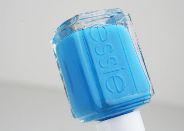
Strut Your Stuff – cobalt aqua
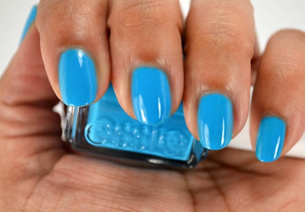
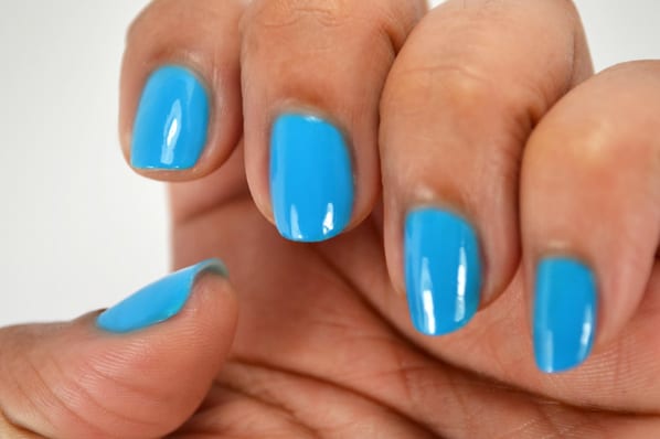
Strut Your Stuff is a bright blue creme that would be perfect for a pop of color in a boring neutral office outfit…a minor nail rebellion! I’ll put together those TPS reports with my red Swingline stapler, but I’ll have fun, super shiny nails while doing it.
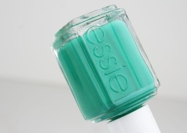
Ruffles & Feathers – peacock teal
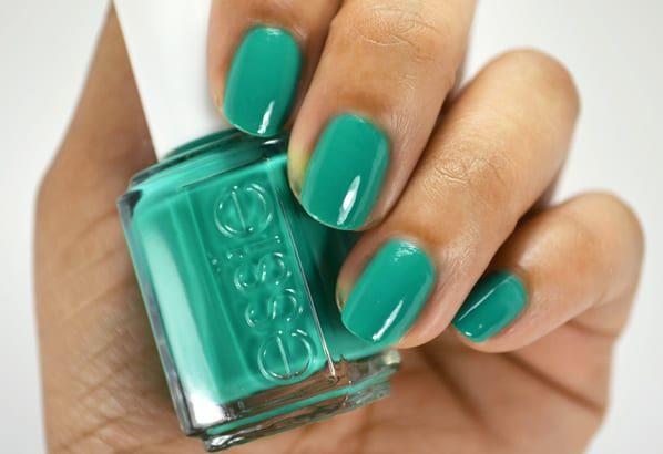
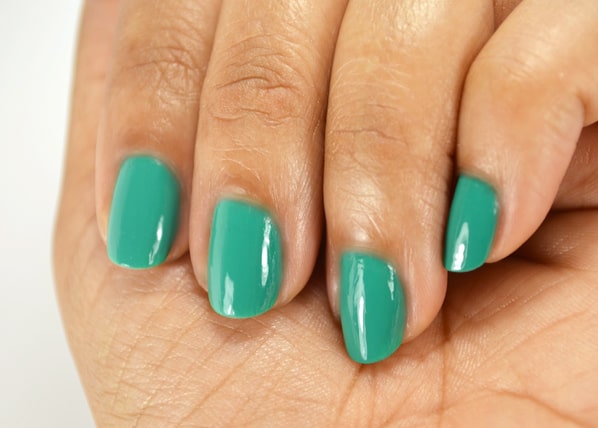
Ruffles & Feathers is described as a peacock teal, but I think it looks awfully similar to Emerald, Pantone’s 2013 Color of the Year. This light jade has just enough neutral in it to keep it from being too bright or giving a sickly cast to your skintone.
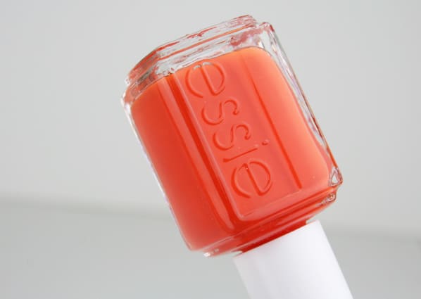
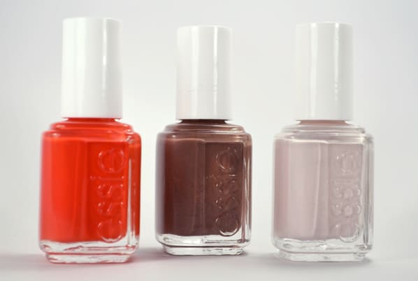
Roarrrrange – bold orange

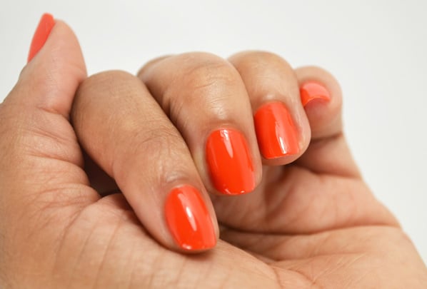
There is nothing neutral about Roarrrrange; a bright, bright orange that almost leans toward a crelly. Orange cremes tend to remind me more of pumpkins than their juicy citrus namesake, but Roarrrragnge is just sheer enough to avoid being flat and boring.

Fierce, No Fear – cocoa mahogany
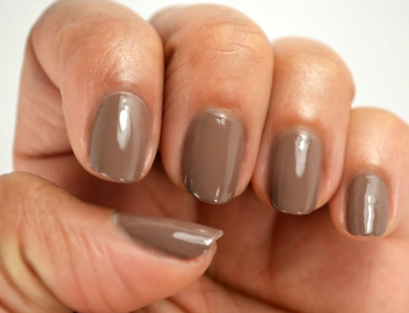

The color of the most perfect cone of dark chocolate gelato, Fierce, No Fear is a surprisingly lovely cocoa brown. (I mean look at it – I just want to take a bite out of the bottle!) This will be a year-round favorite of mine; I can’t wait to pair it with a gold glitter topper, or as part of a reverse moon mani with a soft pink.

Urban Jungle – alabaster orchid
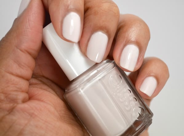
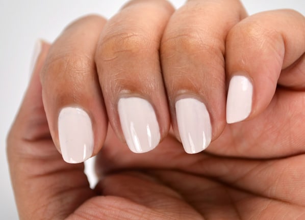
I was fully prepared to hate Urban Jungle. Described as an alabaster orchid, this looked like boring off-white in the bottle; you could maybe call it toasted marshmallow if you were feeling fancy. However, on my nails Urban Jungle picked up a classy, rosy hue that I fell in love with.
Okay, so no nail polish can substitute for cool, blue water and margaritas, but bright, fun nails can make the heat a little more bearable. You might be in Dayton when you want to be in Daytona, but that doesn’t mean you can’t pick up a little sultry and sexy color from the Essie Haute in the Heat line.
What’s YOUR summer daydream, we heartsters? Think any of these colors might help you beat the heat?
photos: Alyssa and Stef for we heart this
I am currently wearing Urban Jungle and love it a LOT for summer. It’s the perfect alternative to getting the look of a bright neutral nail without it looking TOO white. like white-out. which weirds me out a bit, hence why I haven’t worn a starck white mani yet.
It also achieves a look that I would love to get with a lot of Essie’s sheer pale pinks/whites – but without the 3+ coats! I was scared it would be a streaky mess like Fiji but I actually don’t have a hard time with this one.
UGH, Fiji. Such a great color, and such a heartbreaker… I wonder if it might be better with Urban Jungle as a basecoat?
I’ve worn Urban Jungle two more times since I tested it, and it’s just gotten better and better. I think you’re perfectly right, a stark white is too strange, but the white with a hint of pink (or sometimes lavender? It’s hard to tell…) is just right.
One thing about Essie’s line of nail polishes is that the colors are solid and looks like 1-2 coats does the trick! Your nails look really pretty @lyssachelle! Urban Jungle looks like a great summer color! Thanks for the reminder.. I need and I’m so overdue for a manicure and a pedicure!
You’re so right about Essie; I don’t only that many of the brand but I really need to get more. I’m rarely disappointed in their formula!!
Your nails look beautiful, @lyssachelle ! Urban Jungle is the color that most grabbed my attention. I wear so many summer brights that I’m kind of craving a color that’s lighter without being boring.
Hot pink is my go-to summer nail color, but the teal and orange Essie polishes are pretty tempting! My nails are currently a red-orange shade that’s chipping badly.
Great pics, @lyssachelle :)
I want all of these. Now. Especially the orange one. And the green one. And the chocolate one. Okay, yep, all of them.
I really love this collection. It’s kind of a sleeper, it doesn’t have an obvious theme and none of the colors are like “wow, I’ve never seen THAT before!” But they’re really solid, beautiful colors with great pigmentation. Sometimes you don’t need a ton of bells and whistles, you just need pretty polish!