MAC Colourizations – review, photos & swatches
This post may contain affiliate links, which means I may receive a small commission, at no cost to you, if you make a purchase.
MAC’s new eye shadow duos hit a high note
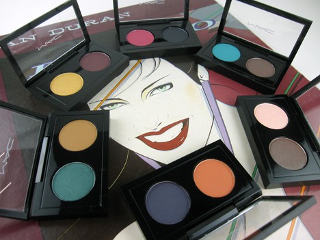
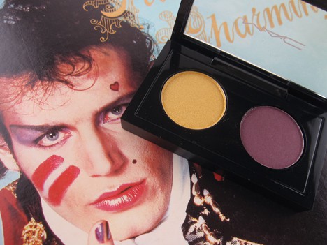
Upon opening MAC’s new Double Feature eye duos ($25), part of the Colourization collection, I had an immediate 80s flashback. And for me, that only means one thing – I headed straight to my record collection.
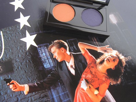
Maybe it’s the vinyl-like shiny black casing of the duo, or the perfectly round shadow held within. Maybe it’s the bold and bright color pairings. Or perhaps it’s the total nod to New Wave in the image on the promo materials…
Am I right or am I right? Is it just me or are you thirsting for a wine cooler? (By the way, wouldn’t a classic record themed collection be a great idea? MAC, are you listening?)
So, I grabbed these fabulous duos, some of my favorite 80s records and had a good ol’ fashioned swatch party, and you’re invited!
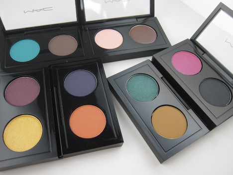
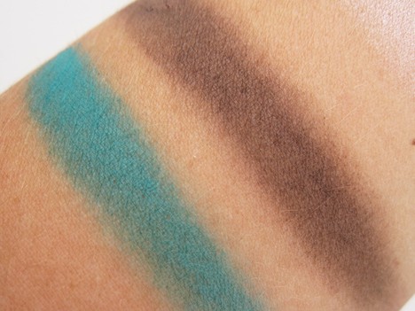
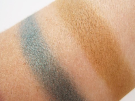
Double Feature 3 is a bright turquoise matte and a dark chocolate taupe satin. The turquoise has a beautiful finish, which surprised me for a matte. The taupe has a visible sheen in the pan that I couldn’t see once applied. And unfortunately, it’s chalky. I’d use this as a liner rather than trying to get large blocks of color, because it doesn’t play nicely. Despite the persnickety taupe, I love this pairing.
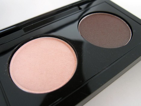
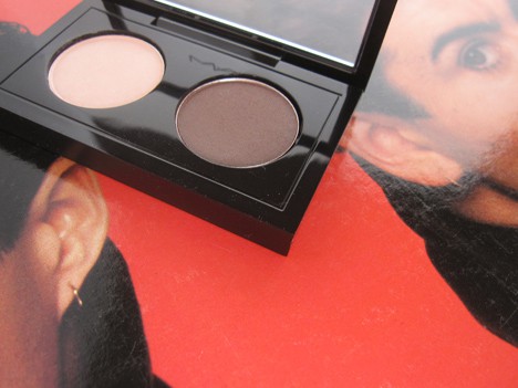
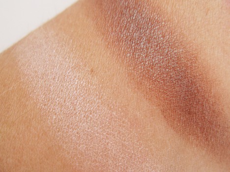
Double Feature 5 are two frosts, a pale peachy pink and red brown with a green duochrome sheen that I always call “beetle-like”. While it’s the mildest duo of the bunch, that green sheen saves it from being too safe.
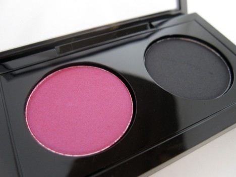
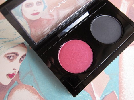
Double Feature 7 is a bright fuchsia frost with a purple sheen and a soft charcoal grey with a satin finish. Again, there was sheen in the pan, but it doesn’t show when applied. And like the satin in #3, it’s chalky too. Boo.
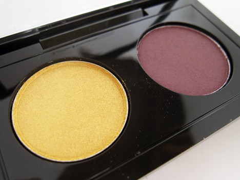
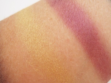
Double Feature 1 is a bright yellow gold veluxe pearl finish and a red grape with a frost finish. This is a really stunning combo, and the gold is pretty darn perfect.
Double Feature 4 is a shimmering metallic emerald veluxe pearl finish and a matte ochre shade (a yellow brown that any painter will instantly know!) I am so all over this duo. It’s such a rich pairing, and I’ve never had an ochre eye shadow before. It seems very fall to me, I can’t wait to break it out with some dark berry plum lipstick. And I have to say, the mattes in this launch have a really creamy texture to them, bravo.
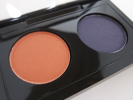
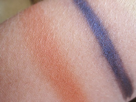
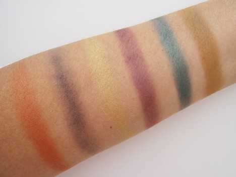
Double Feature 8 is a medium apricot orange frost and a purple indigo with a satin finish. Seriously, what is up with the satins in this launch? As you’ll see in the group swatch below, I could barely get this show up, no matter how many times I tried. But I refused to give up on this one, as it was one of my favorite duos of the launch. My hunch about using these satins as a liner totally paid off. Water made the color sing. And ah-ha, there’s the sheen!
So, what say you readers? Are the Double Feature Duos spinning you right round like a record, baby? Tell us in the comments (and feel free to play guess the album, if you’d like!)
Here’s the whole Colourization collection. Available now at Nordsrtoms, and at MAC later in August.
Pro Palette Eyeshadow x2
Double Feature 1 – Bright yellow gold (Veluxe Pearl) / Pinked-up chrome purple (Frost)
Double Feature 2 – Bright lime (Veluxe Pearl) / Frosty deep grey (Satin)
Double Feature 3 – Mid-tone teal (Matte) / Deep chocolate (Satin)
Double Feature 4 – Deep forest green (Veluxe Pearl) / Mid-tone ochre brown (Matte)
Double Feature 5 – Pale frosty peach (Frost) / Dark brown with green pearl (Frost)
Double Feature 6 – Light grey taupe (Matte) / Mid-tone bronze (Veluxe Pearl)
Double Feature 7 – Bright fuchsia (Frost) / Cool black (Satin)
Double Feature 8 – Mid-tone orange (Frost) / Deep navy (Satin)
$25 U.S. / $30 CDN
Technakohl Liner
Graphblack – Rich graphic black
Photogravure – Soft black with brown undertone
Purple Dash – Intense aubergine
Auto-de-blu – Amethyst
Uniform – Deep khaki green with gold pearl
Jade Way – Pure emerald green with frost
$15 U.S. / $18 CDN
Zoom Lash
Zoomblack – Rich black
$15 U.S. / $18 CDN
Brushes
222 Tapered blending brush
$29 U.S. / $35 CDN
275 Medium angled shading brush
$24.50 U.S. / $29.50 CDN
Disclosure: This review includes products that were provided by the manufacturer/PR firm for our consideration. For more info, or any questions, please see our disclosure policy.










Love, love, LOVE 1 and 5! One looks so wearable and pretty with that sheen. Five would be perfect for some good old MN football watching! Also, colors that I wear regularly and can never get enough of. I think what I like most about these is they are easy to pack if you are overnighting it somewhere and don’t want to bring a lot of makeup. I think I need to head to a store to checkout the liner in Uniform.
@pinkshaya – I agree, a couple of those liners have me intrigued as well..
I wore Double Feature 8 today and I am so in love with it. Unlike anything I have. And that indigo is worth the extra work., it makes a killer liner!
I am a fan of 5…I like neutral eyes so I think this would be my go-to shade. The rest are really cute though. I’m so impressed with your records and use of backdrops for the photoshoot @Stef!
3 and 5 are gorgeous! That teal color is so gorgeous! Three would make a great back-to-college eye look. I reeeeeeeeeeeeeeeeeeally don’t want to start school again, especially since it’s I’m taking math this semester. I’m horrible at math!
I think I like Double Feature 4 the best, though I’m a little underwhelmed with the collection as a whole. I do love the classic albums though!
Being a child of the 80’s, I am instantly drawn to the cool color pairings (and Nagel artwork – so 80’s)!
I especially love Double Feature 3 and 8.
I may be too much of a whimp to wear the bold shadows as is, but as liners- for sure!
This was a fun post @stef! I like #5 the best. Yes, it may be the safe one. But I think that overall it would the most flattering for my skin tone.
MAC should hire you to shoot their next ad campaign, @stef! Your pics made me take a closer look at some of the colors I initially dismissed. Now I think I need to go check out these duos in person.
I like Double Feature(s) 1 and 4 the best. The “perfect gold”? I’m in!
Lucky lucky me, my mailbox had a treat today! And I’m here to shout it from the heavens- The gold of Double Feature really is THE PERFECT GOLD! OMG, I love it. I think I need to go buy backups (yes, plural) because I’m going to be wearing this gold over and over and over again.
All this of course isn’t to discount the red-toned grape. The finish is gorgeous and the color is very build-able. The red undertones, surprisingly, really seem to make the lighter bits of blue in my eyes pop. The only complaint I have (and it’s a tiny one) is that the color can be a little hard to blend out.
I give Double Feature 5 stars, because really- IT’S THE PERFECT GOLD. No questions asked!
Her name is Rio and she loves turquoise and sand. Ah, 80’s.
@sherrishera – that might just be the most clever thing I have ever read!
I think I’ll skip this collection. The shades are underwhelming, and I like to use lots of shades on my eyes, not just two.
Lucky me, I received Double Feature 3 for testing and I love these colors! Yes, the dark chocolate taupe is chalky, but I was able to work around this issue by using it, as @stef suggested, as a liner, and using the gorgeous turquoise on my lid. So pretty!