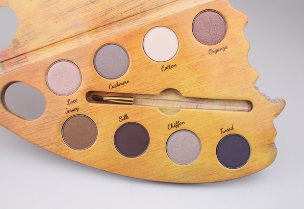
Nonie Crème Colour Prevails Watercolour Eye Shadow Palette in Nude and Neutral, swatches and review
This post may contain affiliate links, which means I may receive a small commission, at no cost to you, if you make a purchase.
As a fan of Russian author Vladimir Nabokov and his lushly intricate writing (Lolita only scratches the surface), I’ve come to really appreciate butterflies. You see, Nabokov was an accomplished lepidopterist—in other words, a butterfly scholar. The winged creatures flew through both his scientific and fiction writing, blurs of bright color and astonishing beauty.
I’m no butterfly expert, but the new cosmetics line Nonie Crème Colour Prevails uses the trope of the papillion (trust me, the French word for butterfly is much prettier than the Russian one) in an entirely charming way.
Exclusive to Walgreens, Colour Prevails was created by Nonie Crème, previously the founding creative director of Butter London—need I say more? I need not, but you know I will: she also has a truly excellent undercut and a rakish sort of punky/goth/magpie style, one that radiates a glamorously oddball charm.
This unique sense of personal style translates beautifully to Colour Prevails; from form to function, the line feels special and a little rare, especially in the context of the average Walgreens store. The displays, each product adorned with a butterfly motif, are a lovely little surprise amongst toothbrushes and batteries.
Please note: On this palette that I ordered for photos/swatching, the shadow names listed next to the pans are incorrect. Which is rather frustrating and a few points are (mentally) taken off for the packaging error. Amity’s palette (the reviewer) was correct. ~Editor
Although I often succumb to the siren call of Sephora, I also search for drugstore gems, and the Colour Prevails line is a nice compromise: affordable but a little more luxe than your standard brands. I sampled several items, and the standout was the Watercolour Eye Shadow Palette. First, we have to talk packaging. The eye shadow set, in Nude & Neutral, is designed as a butterfly wing, with the interior of an artist’s palette. It is kind of an unusual shape, but it travels securely with a magnetic clasp, and the die-cut cardboard is sturdy yet light. Let’s be honest here: even if the shadow itself was subpar, I’d still prize this lovely palette for the aesthetics alone.
Luckily, however, the shadows don’t disappoint. There are eight microglitters, all of them sparkly yet subtle metallics in a soothing range of neutrals. Tonally, the shades remind me of river rocks; browns and creams and greys shot through with fine veins of iridescence. These are definitely on the cool side, and the majority of them apply smoothly and silkily (the exception to this are the darkest shades, which feel a tiny bit gritty at first application). As a whole, these are easy to layer and blend, and you can wet them to intensify the color pay off.
Speaking of color pay off, most of these are winners—the shadows aren’t super bold, but they create a rich wash of color. The exception to this rule is Chalk; true to its moniker, it is so pale that the pigment barely shows up. However, it does work nicely as a highlight, so I’m not mad at it. Overall, these shadows do perform best with a primer for extra oomph, and will eke out a solid five-six hours with minimal creasing/sliding.
Sand: pinky champagne
Pebble: metallic greige
Chalk: pink-kissed ivory
Jasper: rosy bronze
Fossil: smoky brass
Rock: chocolate brown with gold shimmer
Stone: cool pewter
Gravel: smoky gold-lit purple gray
I appreciate the versatility here, too—I’ve used these neutrals to create a polished daytime eye but also like them for a smokier, cut-crease nighttime application. Essentially, it’s a workhorse with the soul of a butterfly, to really mix my animal metaphors. Nabokov would approve (I mean, probably he wouldn’t care, but if he had to pick any palette in a hypothetical dead-literary-genius-shops-makeup-scenario, I’m confident he’d go with Colour Prevails).
Have you checked out the Colour Prevails line yet and if so, what grabbed your fancy?
Amity writes and teaches in Central PA. Her obsessions include: Rodarte (she can’t afford any Rodarte, mind you, but a girl can dream), espresso, books, vintage/thrift fashion and fountain pens. She thinks you should dress like a weirdo once in a while, just to shake things up.


Oooo, PRETTY. I LOVE Nabokov, and this palette. These don’t look terribly pigmented in the pan, but wow, do they pop on your skin! Jasper and Rock are just gorgeous, and they look super wearable for any skintone.
Ah, dying to know what your fav Nabokov book is!
It is a total charmer of a palette!
Well this palette is some serious eye candy! Great post, @amity!
Yesterday, I played with this VERY cool palette. It was like I was an artist for the first time. The only thing I would suggest is to add a small mirror. I took about 5 minutes and applied Nonie Crème Color Prevails Nude & Neutral(they are so my colors!),yes, I was pleasantly surprised at the staying power and how well they blended. Kudos to this company for making a quality, practical product that’s affordable. I normally don’t wear much eye shadow during the day, but I may start, cause I sure got the compliments, one right after the other! Thanks Nonie!
A small mirror is a great idea! Have you tried any other Colour Prevails products yet?
Wow! Gorgeous. I haven’t heard of this brand before, but I’ll have to look for this palette next time I’m at Walgreens. It looks awesome.